More educational engagement, better results

Hello to my readers!

It has been a very long time since I have posted in Fashion|Academic. Indeed, my readers deserve much better! Yet there is a reason for the sparseness of my posts. First, after teaching fashion for two and a half years as an adjunct at the Escuela de Artes Plásticas of Puerto Rico, I have applied for, and been accepted to, a PhD in History at the University of Guelph in Canada. It was my utmost desire to return to school and complete my graduate education. Most importantly, the lack of scholarship about King Malcolm III, otherwise known as Malcolm Canmore,[1] propelled me to do a thesis about him. Thus, I have left behind my days in fashion to embrace life as an academic and as a Scottish medievalist.

Or have I?

While completing the major and minor seminars for my first year of PhD, I began wondering about the efficiency of my undergraduate teaching. Had I made a difference to my students when they took my fashion illustration courses? Would I made a difference to undergraduate history students when I teach the subject? How can professors, and educators in general, make a difference? After the death of Professor Louise Wilson, I realized the impact her educational (and rather legendary!) techniques had not just on her students, but on British fashion in general. The outpours of grieving students and alumni who praised her no-nonsense and straightforward teaching approach signaled an effective educator keen on extracting the best from her students. When educators believe in their students, and they let their students know that they believe in them, students react positively to teaching. Yet Western education has become an ode to automated responses, memorization exercises, copy and paste assignments. We need to change our educational strategies: we need to aim to produce professionals with deep problem-solving, critical analysis, and visual and verbal communication skills. Fashion is not immune to a redevelopment of educational strategies.


So, how do we improve our teaching techniques to get the best out of our students? Engage with them. Know them. Know their strengths and weaknesses. Creating an effective relationship with each one of your students will enhance their educational experience and, in turn, the quality of their output.

Fashion, unlike other subjects, cannot be memorized and regurgitated on a multiple-choice exam. That is one of the advantages art and design disciplines have over other liberal arts: they can only be taught effectively through practical, critical-thinking and problem-solving exercises. Through the use of critical thinking exercises, fashion teachers can engage with their students in a more direct manner.

Take fashion illustration, for example. There are multiple textbooks that show how to make a nine- or ten-head figure, how to draw faces, hands, feet, accessories, clothes, different poses. In many schools, fashion illustration is taught by either copying from the textbook or by copying the instructor’s style. Neither educational tactic allows for the student to experiment on their own. It does not allow for students to develop their strengths and address their weaknesses. It does not teach them that fashion illustration is not a mere means for communicating a design— it is an art form in itself. It requires extensive research into poses, looks, materials and techniques to do a compelling visual rendition of the style, fit and attitude a certain design (and designer) wants to convey. Fashion illustration delves into anatomical knowledge, and drawing the human body without knowing how it moves in real life makes it impossible for students to understand how to draw certain poses, or how to improvise their own. In my view, drawing with a live model is paramount to teaching fashion illustration. In many cases, we have forsaken live model drawing for textbook copying, hindering the students’ ability to critically think and understand about how clothes are drawn correctly over a human body and how different mediums and techniques best serve to represent different attitudes, fabrics, and designs. By re-taking the live model approach, fashion illustration education is made more relevant to students.

One of the biggest differences between the American and the British education style lies in the emphasis on primary research. At undergraduate level, I rarely did any primary research: students relied solely on trend forecasting publications such as Here & There and WGSN. Yet when I studied at Central Saint Martins, our course heavily relied on students doing primary research for their topics. Our sketchbooks became our best friends. Before, I only did the first designs I could think of and call it a collection. In London, I was using a full sketchbook for collection, drawing over a hundred sketches for one or two designs. The quality of my designs, and my ability to critically solve problems, improved dramatically. I used the same technique for my advanced fashion illustration classes: all students needed a sketchbook, and they would go to the library to do extensive research about how to best illustrate a given collection. They would come with piles of photocopied images from the fashion and from other art books. They would go to art stores and research which type of paper and of paints would be better for illustrating their collections. They became engaged with their illustrations; drawings were not a mere chore but an exercise on how to communicate ideas effectively through visual media.

By the end of the semester, the difference in their skills and presentations was astronomical.

I took time to see every single of my students’ ideas, suggest them different materials and techniques, and understand where they were coming from. I gave ample feedback. I knew that feedback was key to their success. But the process was not one-sided: students also learned about how I operated and what I wanted from them. They knew my standards were incredibly high: I believed in them. In the process, they learned that they could become fashion designers, even when they attended a relatively young fashion design program in Puerto Rico, where there is no fashion industry. As a school, we could not offer the amenities that came with attending Parsons, or Central Saint Martins, or London College of Fashion. But I could offer them the chance to develop their skills and ideas in par with what they did at more recognized fashion schools. And more importantly, they had the chance to believe in their talent.


Sometimes, educators do not know if they make any difference in their students’ lives. They sometimes do not know how to make that difference. Fashion is a very technical trade and fashion education is geared towards teaching students technical skills that employers search for. But we also need to teach them how to solve problems, how to think on their own feet, and how to do enough research to allow for innovation and creativity to flourish in their work. If educators decide that the way fashion education is imparted does not fulfill the intellectual development of their students, fashion education can improve. Students can improve.

It is up to us educators to find alternative methods of teaching that will engage our students better with the industry, producing innovators, not merely employees. An education where learning problem-solving skills through direct interaction with the professor will certainly improve the quality of the students’ academic experien


[1] Malcolm III (1058-1093) was the son of Duncan I and he killed King Macbeth (yes, the one from the ‘Scottish play’) in real life. He also was married to a saint: his second wife was Saint Margaret of Scotland and her life and miracles have certainly eclipsed Malcolm.


Pigeons and Peacocks: The London College of Fashion Magazine

Recently, I received my free copy of Pigeons and Peacocks (issue 4), the London College of Fashion magazine.

I was amazed at the quality and diversity of the work published.

The first editorial, Rumours, by Haley Louisa Brown, is simply exquisite: a hippie/gypsy fantasy of black-and-white proportions. A stunning draped white dress with long, romantic sleeves by Meadham Kirchhoff takes center stage in the first page of the magazine, setting the mood for the editorials to come. It is a nod to nostalgia. Nostalgia, as explained in the Editor’s Letter, ‘is what imbues ordinary objects, places, people and things with a mythical power they would never have naturally possessed’. The issue aims to rescue those things vintage, ethnic, antique and cherished and reclaim them, assigning them a new forum (the published magazine) imbedded with new significance.

The editor, John William, strives the perfect balance between linking a common theme, nostalgia, in both picture editorials and relevant articles, with self-promotion for LCF’s fashion students. The writing is not superfluous, and it reaches new heights by providing a space for academic discussion. Case in point, Alexa Gould-Kavet’s article, ‘The Demise of the Subcultural Identity: Towards a Postmodern Theory of The Hipster and Hipster Style’, reflects on the need for redefining what subculture means and how that affects understanding hipsters. All in all, contrary  to other subcultures, hipsters are not defined by ‘culture’, but by ‘taste’; the hipster subject rejects mainstream culture and embraces all that is ‘indie’, bohemian and/or different. Of course, if you go to Central Saint Martins, and to LCF itself, you’ll notice the abundance of these hipsters and they are easily identifiable by their dress: skinny pants, dishelved appearance, vintage clothes, red lipstick. They’ll raid vintage shops or Topshop. They all look the same.

On a lighter note, other editorials include Paint, by Saga Sig, featuning mostly painted dresses by Tanya Ling. The beautiful Babes of Benin, also by Sig, displays the talent of LCF’s students to the fullest with Sara Arsenén’s upside-down bra. This ‘bra’ completely redefines the object as an purely aesthetic one, denying its main function: to support the bust. Colorful, creative, and innovative, this editorial blends African conciousness and fashion sense with European fashion taste. This is accompanied by an article, ‘Black-sploitation? Opening the debate’, about the exploitation of the past, and in this case, of African cultural past.

I highly recommend this magazine, it was a pleasant and unexpected surprise. The quality and professionalism of the content is something fashion students should all aspire to. I think that, by subscribing to this magazine, many students will be more conscious of their environment and of the tools available to study fashion, trends and its cultural background. Well done!

Sears Catalogs: The Social Self and Fashion Illustrations

I received today my order from Katie Blueford, who specialises in selling vintage pages, and I am so excited! I bought twenty pages of a 1902 Sears Roebuck and Co. catalog depicting their fashion illustrations.

Why? It is a fantastic addition to my fashion courses, especially Fashion Illustration and Trends, Fashion and Society.

Sources like fashion and store catalogs from the turn of the 20th century are indispensable to learn about what were people wearing, how was clothing sold, and how illustration is used to not only depict clothing but to lure customers into buying it. It is ironic, since the illustrations in the Sears catalog are photo composites, using the head and limbs of pictures of real women but with the clothes drawn on top of those pictures. This is the same fashion illustration method used in fashion schools in London, particularly Central Saint Martins and London College of Fashion.

Wash Suits and Dresses

Another feature of these illustrations is the distortion of the female figure. The ‘S-shaped’ silhouette was in vogue during 1902 and the illustrations help women fantasize how their bodies will change once they order those specific clothing items and wear them. Remember, fashion illustration not only sells you the clothing, but the mood it seeks to convey. It is about the fantasy, about becoming someone else when one wears certain clothes. Psychologically, these illustrations lure the customer into a fantastical world where their bodies will become, through using specific garments (and undergarments), socially-approved.

Moreover, the use of photographic images of real women superimposed to intaglio drawings supports the notion that the silhouette suggested by the illustration is not only socially desirable, but physically possible. The body is fragmented into two different units that look entirely independent of each other! With the correct undergarments, women can have 16” waists, heavy upper-bodies and smaller hips.

Rainy Days or Walking Skirts

Who knew a Sears catalog from 1902 could tell us so much about how people function in society and how fashion and society are related? What other conclusion can we draw from these illustrations?

Book of Kells Collection- Update

I know it has been a little while since I have updated on my “Book of Kells” collection, but I have had so much going on!

Alongside my teaching and working independently on this competition, I am also working on a jewelry line, fixing problems with my PayPal (I always have problems with the damned PayPal account), and preparing to construct a new dress for a client.

It is more work than one would think it is!

As for the collection, I have developed the dress silhouettes further, as I only have to sew one (I might do more than one; I don’t know). I looked for more pictures of the Lindisfarne Gospels because they have a sequence of red dot designs encasing the handwriting that are mesmerizing and that I could reproduce with embroidery quite well. I probably won’t be using red as I want to keep a simple palette, but I do want the heavy embroidery stitches and the eye-catching trapunto.

Academically, I have had trouble finding information on literacy amongst monks and/or why would the monks transcribe incorrectly the Vulgate verses. I would like to know more about how the book was produced, if it was customary not to use a written version but to trust one’s memory when writing illuminated manuscripts. Then again, maybe they spent so much time and effort doing these fantastic illustrations that the Bible content became secondary.

Research, for whatever purpose it may be, takes a lot of time. I have to have it all ready by 30th June so I have to hurry up.

I have also been preparing for another class and I have taken to research on Rousseau, the French Revolution and fashion. I’m not precisely a fan of French stuff, apart from pastries and Dior, but one has to research just as much for myself as for my students.

Book of Kells Collection Part 2: Research

‘[…] Research means creative investigation, and good design can’t happen without some form of research. It feeds the imagination and inspires the creative mind.’[1]

Part two of this series of posts is precisely about the importance of research for creating a concise, creative and mature fashion collection. As you might remember, my first post about this collection is about finding a theme, which in my case it will be the Book of Kells (Trinity College, Dublin) and Lindisfarne Gospels (British Library). Once I established the main theme, I have decided to ditch the Lindisfarne Gospels and concentrate only on Kells. Why? Because I was intrigued by the Latin verses and the decorating motifs and because I have found other bits of information that make this book all the more tantalizing.

First of all, there is evidence that the Book was started at the island of Iona (called Hy until the 14th century)[2] and later sent to Kells, in Ireland. As I previously discussed, we cannot tell which part of the book was produced where, but we do know that it is clearly associated with St Columba (this includes Iona, Kells and Lindisfarne). One of the illustrations (fol. 201r) is a fish-man that is grabbing the T-stroke of the word fuit in the genealogy pages in Luke’s Gospel. Right next to fuit is the word Iona (prophet Jonah), from which the name of the island is derived.[3] Iona is Hebrew of Jonah, and its Latin equivalent is columba. Both words mean ‘dove’. Colum Cille (St Columba) means ‘the dove of the church’ in Gaelic, for those of you who are curious. Adomnán, abbot of Hy (Iona), in his Life of Columba, describes how St Columba (d. 597) is indeed named after the prophet Jonah.[4] Therefore, Meyvard concludes that the fish-man figure is pointing out the phrase fuit Iona, not because it signals the name of the island where the manuscript was written, but because that was the name of the saint associated with the monastery where it was probably produced.

Secondly, some of the figures in the Book of Kells resemble figures found in Coptic manuscripts. A Frankish monk by the name of Arculf visited the monastery of Hy when Adomnán was abbot and stayed there enough time for Adomnán to write about him. De locis sanctis was an account of places in the Near East according to the testimony of Arculf.[5] Arculf spent time in Egypt and maybe brought manuscripts or other sort of visual material that contained Coptic illuminations, and this was probably used as inspiration for various illustrations in the Book of Kells (mainly, fols. 72.v, 273r and 309v).[6] This is noted also by Francis E. Stephens, who in 1946 took pictures of  some understudied pages of Kells. He noticed certain interlineal designs that resembled some sort of Eastern script in red ink, and usually was accompanied by a small illumination of a lion. These were used to denote stops in the manuscript text and they may very well represent an Insular scribe’s attempt to copy a script of which he knew neither the language or alphabet.[7] Eastern art may have made its way into Insular manuscripts.

It is this last detail which has captured my attention today. A simple design, a mixture of Eastern script and art and Insular designs, that can be further explored for aesthetic purposes. Since I have already satisfied my academic instincts for today, I think it is time to move into the fashion bit.

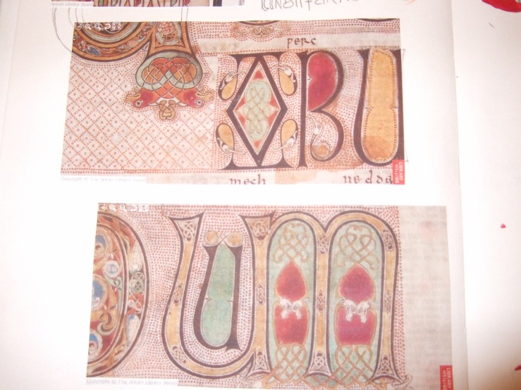
I started my research book (or sketchbook) where I collect and analyse the material gathered. I start by collecting various photographs and images of designs in the Book of Kells and Lindisfarne Gospels to see the artwork in question. I have also reproduced some artwork by hand with gouache and repeated some of the animal designs.

To the left, Lindisfarne Gospels (images taken from the British Library webpage, http://www.bl.uk), and to the right, images from the Book of Kells.

Left: ‘Tunc crucifixebant […
I am focusing on the animals portrayed (lions and dragons primarily) because I found that using the letters might not work. Since I plan on using neutral colors to keep with the brief given, I want the design to be noticeable enough in trapunto and embroidery stitches without it looking patchy and grandma-like (sorry, Grandma!). Sketchbooks provide you with the opportunity to play with ideas and develop them fully (or discard them if necessary) by giving a platform where to process and analyze the complied information. They are ‘a window onto your thinking processes and clues as to the origination of your design ideas’.[8] What is more important, sketchbooks are not solely for your use, and what my students usually forget is that industry individuals can and will ask you for your sketchbook, in addition to your portfolio.[9] So you have to keep in mind that you have an audience and you have to be clear and precise about your research investigation. Don’t pretend everybody to understand what your thoughts are!

Images from beasts and interlacing from the Book of Kells. Top left: possible trapunto design
Lindisfarne Gospels

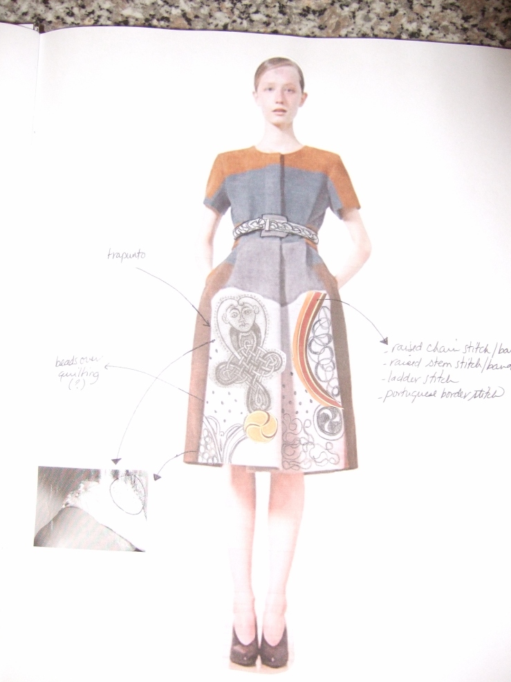
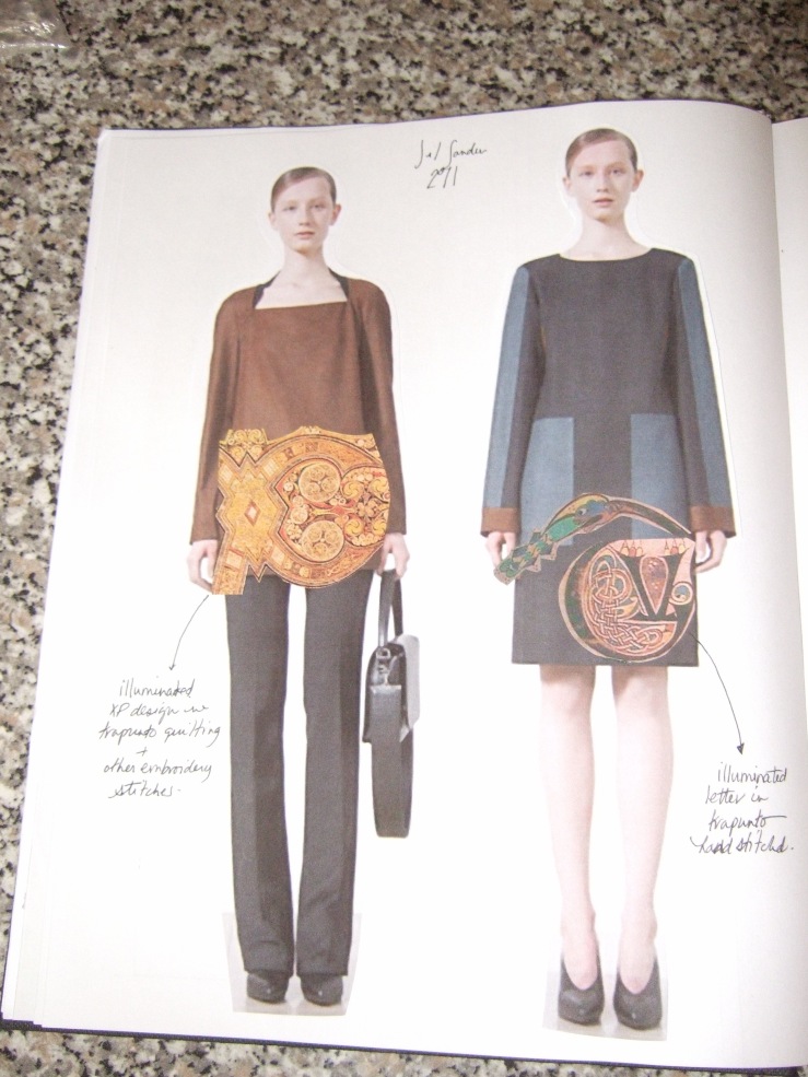
Here I include some photos of my research so far. Notice how I have also collected information of current trends and silhouettes that can inspire what I want the collection to look like. I chose Calvin Klein and Jil Sander A/W 2011, in addition to some dresses by Louise Gray. A trick that I have is to use pictures of designs I like and embellish them with possible embroidery designs to get a good sense of proportion and silhouette before I design my own clothes. This process also helps you to clarify ideas and can aid in the technical aspect of design—pattern cutting. Before you even put a pin on your dress form, you can decide if the proportion you have in mind is working or not and that saves you LOADS of draping and drafting work later.

I hope you find this interesting enough since it is a very long post!

Sketchbook page on silhouette. Jil Sander A/W 2011 and Louise Gray
More research. To left: ‘Secret of Kells’ movie (2009) Nominated for an Academy Award for Best Animated Picture.
Jil Sander 2011 with collage and drawings by me. This aids in deciding proportions, silhouette, colors and embellishment placement.
Same as above. Jil Sander 2011.

[1] Richard Sorger and Jenny Udale, ‘Starting your research’, The Fundamentals of Fashion Design. (Lausanne: AVA), 16.

[2] Paul Meyvart, ‘The Book of Kells and Iona’, The Art Bulletin. 71:1 (1989): 6-19.

[3] Ibid, 6-8.

[4] Ibid, 9.

[5] Ibid, 13. Bede also wrote a book named De locis sanctis where he mentions Arculf because Adomnán presented a copy of his De locis sanctis to king Aldfrith of Northumbria in 686 AD.

[6] Ibid, 13-19.

[7] Francis E. Stephens, ‘An Interlinear Design in the Book of Kells’. The Journal of the Royal Society of Antiquieries of Ireland. 76:4 (1946): 213-15. Yes, I know this is an outdated source and the debate has probably moved on. Remember, I am trying to do a fashion collection!

[8] Sue Jenkyn Jones. Fashion Design. (London: Laurence King/Central Saint Martins; New York: Watson-Guptill, 2002), 152.

[9] Sorger and Udale, 22.

Book of Kells/ Lindisfarne Gospels Collection Part 1: Idea

Now, I will introduce you to fashion researching. My next fashion venture (apart from this blog) is to create a collection based on illuminated medieval manuscripts, especially the Book of Kells and the Lindisfarne Gospels. I have always had a fascination with medieval manuscripts, particularly Kells. I even bought the Paperblanks notebook witth the embossed cover reproducing the ‘Generationes’ (the beginning to the Gospel of Matthew) page from the actual Book ($16, now that is dedication!). The Book of Kells is housed in Trinity College, Dublin, where it is on permanent display.

The Book was created around the 9th century (790-810 AD) and even though the evidence is inconclusive, it was probably started in the monastery of Iona (an island off the northwestern part of Scotland) and later taken to Kells (in Ireland) for finishing. Whether the Latin script, based on the Vulgate translation of the Bible done by St Jerome in the 4th century, was written in Iona or in Kells is also a mystery. What we do know (which I noticed in one of the photos of the book) is that the Latin has a number of grammatical errors.

For example, and here I deviated from my original intention of designing clothes, this page with a ‘quote’ from Matthew 27:38:

Matthew 27:38

The Latin reads: ‘Tunc crucifixebant XRI (abbreviation of Christi) cum eo duos latrones’. Right away, if you know Latin, you can notice something is a bit… odd. The translation of this passage would read a bit as it follows: ‘Then they were crucifying  Christ with him (cum eo) two thieves.’ (Here I must add, if I mistranslated this passage, DO let me know!)

See what happens when I get distracted? I lose the plot completely. What does this has to do with designing a collection? Probably nothing. But I am already wrapped in this mystery and I have to pursuit it all the way, in the name of academics fashion.

I checked the Vulgate translation of the Bible according to St Jerome (go to: http://www.sacred-texts.com/bib/vul/mat027.htm#038) and the actual text for Matthew 27:38 is the following: ‘Tunc crucifixi sunt cum eo duo latrones: unus a dextris, et unus a sinistris’  (‘Then were crucified with him two thieves: one to his right and one to his left’). This means the monks messed up their Latin. Why? I am still not sure. According to Wikipedia, there are numerous errors of such fashion in the Book of Kells because, rather than transcribing from a master copy of the Vulgate, the monks wrote down the text from memory. That’s quite the accomplishment. I will keep posting on the developments of this curiosity if and when I manage to find out more about it!

But the reason I chose the Book of Kells was not so much for the textual content (as we can see, the monks apparently did not pay that much attention to it either) as for the artwork. It is one of the most intricate works of medieval art and one of the most important Western manuscripts there is. The delicate Celtic interlacing is combined with various pagan motifs that result in pagan imagery used for Christian purposes.

‘Generationes’ page from the Gospel of Matthew

And I want my collection to reflect such handmade artistry while remaining faithful to a woman’s body and contemporary design. How do I take such delicacy and insert it into my work? Quilting and trapunto are my point of reference, technique-wise.

patchwork quilting
Trapunto

This should enable me to experiment with surface design and translate the drawings in the Book of Kells into womenswear. This also reminds me of a medieval quilt at the new Medieval and Renaissance Galleries in the Victoria and Albert Museum, London (V&A). More research is needed for doing the collection. I have just started! SO stay tune for part 2: Research, coming soon enough.